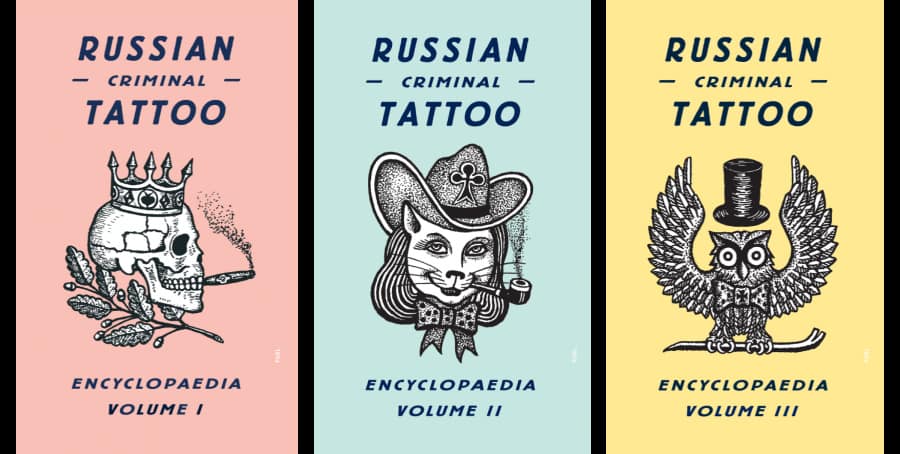
The soft-pastel dust jackets of FUEL’s Russian Criminal Tattoo Encyclopedia are a jarring counterpoint to the archive’s violent and profane drawings. Damon Murray and Stephen Sorrell relish such juxtapositions. “People normally think of graphic design as communication, for the purposes of direct messaging,” says Murray, who in 1992 co-founded the London-based graphic design and publishing company with Sorrell. “But if you subvert that, it can go completely the other way. You can use it for misinformation or for messages that leave a person questioning what they’ve been told.”
Murray and Sorrell experimented with these tensions in a magazine (also called Fuel) that they self-published with Peter Miles and Nick Oates while graduate students at the Royal College of Art. Both the name and the magazine’s wry, experimental compositions were a reaction to their tutors’ “deadly boring” assignments. “We needed to get a bit of traction and energy,” Murray says.
Their rebellious attitude didn’t soften after leaving university. Instead of applying to major design firms, they rented a studio in Spitalfields, an East London neighborhood that was unknown to many of their clients but which would soon become popular with artists. Low rent helped them purchase a then-expensive computer, which was a barrier to entry for most designers who sought total independence. Twenty-nine years later, they are still at the same address. With no assistants, they are also responsible for every aspect of their work, from media campaigns for MTV, Levi’s, and Liberty to eclectic books including Dressing for Pleasure: Rubber, Vinyl & Leather and Chernobyl: A Stalker’s Guide.
The latter is the most recent title in the Soviet niche for which the company is best known. This unexpected and ever-growing section of their portfolio stems in large part from a 1992 trip to Russia, to produce their magazine’s third issue. “I was 21, and aside from day trips to France, it was the first time I’d been abroad,” Murray recalls. “It was a weird and exciting time. The ruble was going through the floor. We were in the hotel lobby, and an American guy in front of us exchanged about $200. He left with a pile of money, and, when we stepped up, they just pulled down the blind because he had cleaned out the bank.”
Their unfamiliarity with the Russian language rid them of the preconceptions with which they had been trained to read graphic design. “Sometimes the fantasy is more interesting than the reality,” Murray declares. With a smile, he mentions a set of TK-pressed posters ubiquitous throughout sub-zero Moscow. Because the paste had frozen, they were easy to peel off walls and take home. Years later, and after a few Russian lessons, Murray came across them again and discovered that what they considered “amazing artifacts from the Soviet Union” were ads for Arnold Schwarzenegger and Jean-Claude van Damme blockbusters. The truth doesn’t detract from their effect however. Rather, it illustrates how vernacular design in particular can elicit confusion or contain unintended messages of the sort visible throughout FUEL’s history.

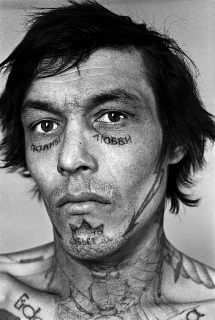
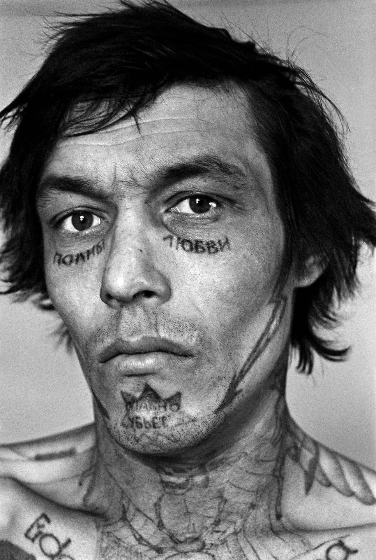
A decade later, they began work on their first book, the Tattoo Encyclopedia, with Danzig Baldaev, a former guard at St. Petersburg’s Kresty Prison who copied by hand over 3000 tattoos found on prisoners’ bodies. It became a cult hit and led to two additional volumes, international gallery exhibitions, and cheeky tie-ins like playing cards and postcards.
Major success has never been the goal though. The duo is content with their scale (three or four books per year) and in their quiet status as outsiders in both the graphic design and publishing communities. Who else would publish books about a candy-wrapper collection and Soviet space dogs? And few, if any, publishing companies of FUEL’s size has such an extensive distribution network. “It’s about making things that we feel should be out there in the way that we visualize them,” explains Murray. “When you spend time on something that you think isn’t going to work for you, all you think about is the time you could have been spending on something else.”
Preservation, not profit, is perhaps the most self-conscious aspect of many of their endeavors. “We’re definitive by default,” Murray says, chuckling. This awareness influences product design too. “For ALCOHOL: Soviet Anti-Alcohol Posters, we debated about going with 192 or 248 pages. In the end, we went larger, to fit more. Quite often we’ll do that, or choose more expensive cloth or paper. This isn’t necessarily business smart, but, for us, it makes a difference.”

