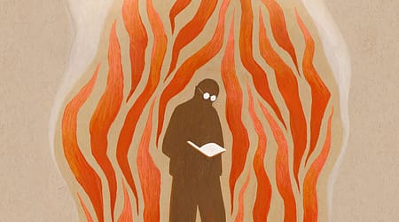

Just before the world shut down in 2020, I took on an unusual assignment—curating a library for a luxury apartment building in downtown Manhattan. The space was vast, stretching on either side of an atrium tall enough to accommodate a small grove of graceful silver birch trees. The job seemed straightforward at first, but I’d underestimated the scale. Week after week, I dragged more boxes past the ever-immaculate doormen, unpacking and shelving, only to find the shelves still looking thin. It felt like an impossible task. Finally, I turned to the most prolific authors I could find: Agatha Christie, Stephen King, Philip K. Dick, and Georges Simenon—the Belgian legend behind more than 400 novels, many featuring the imperturbable Inspector Maigret. I felt a quiet joy at the thought of a Simenon completist stumbling into the library to find the author’s entire oeuvre on display there.
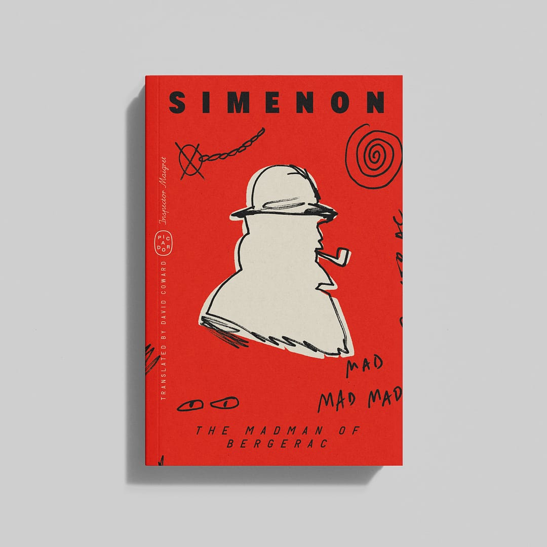
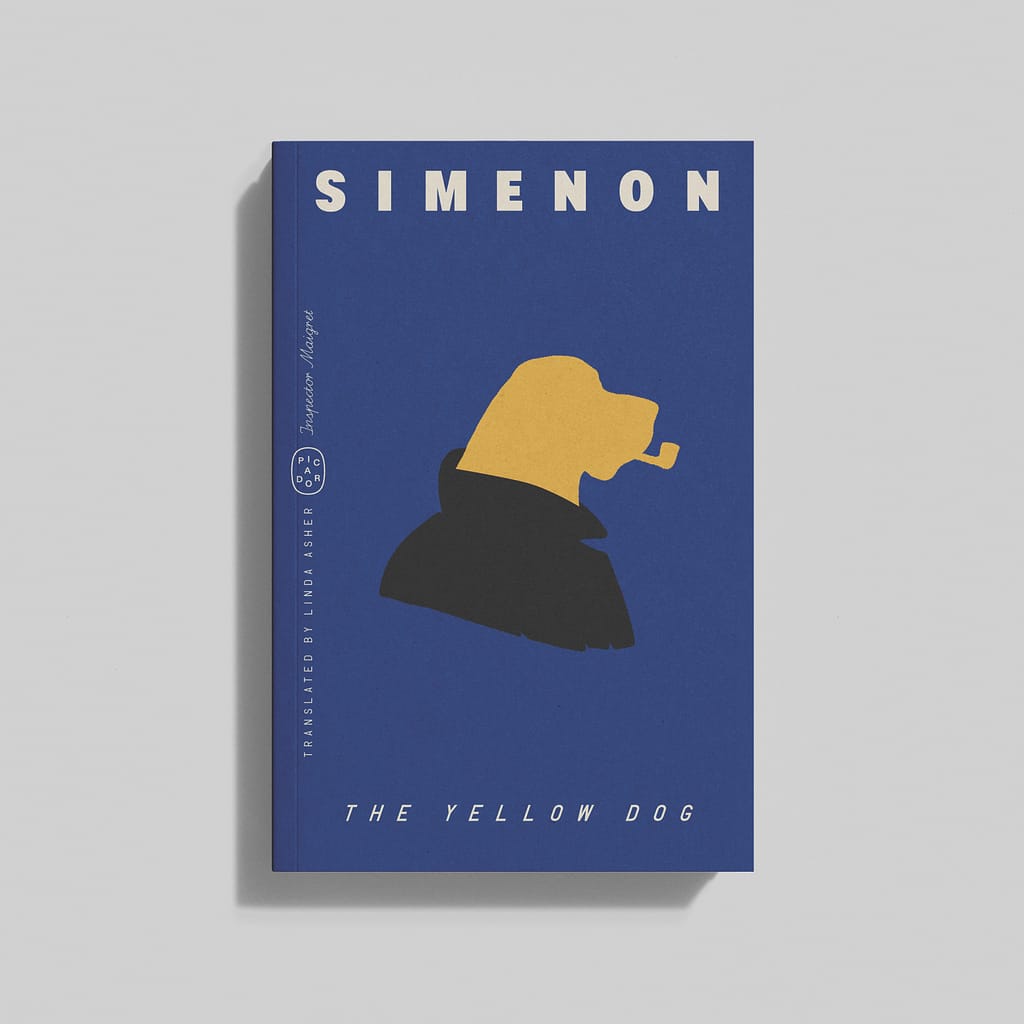
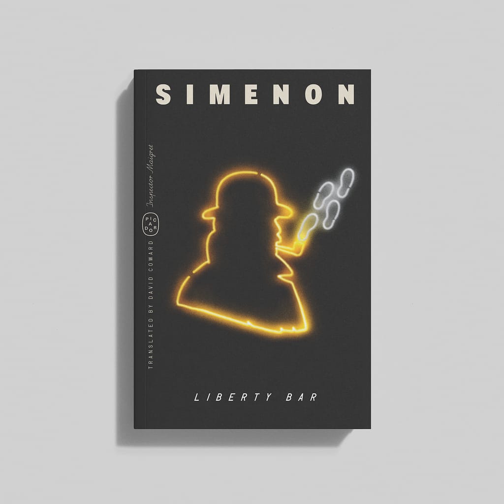
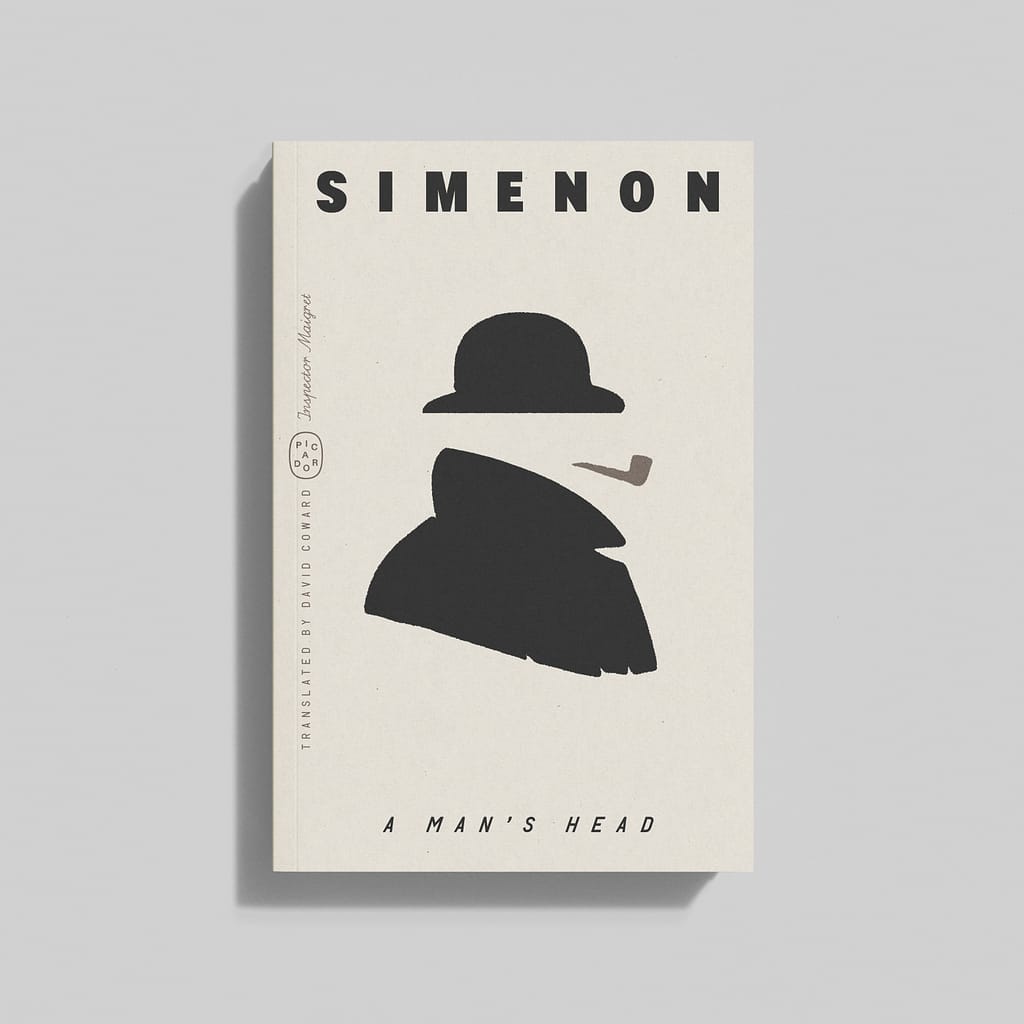
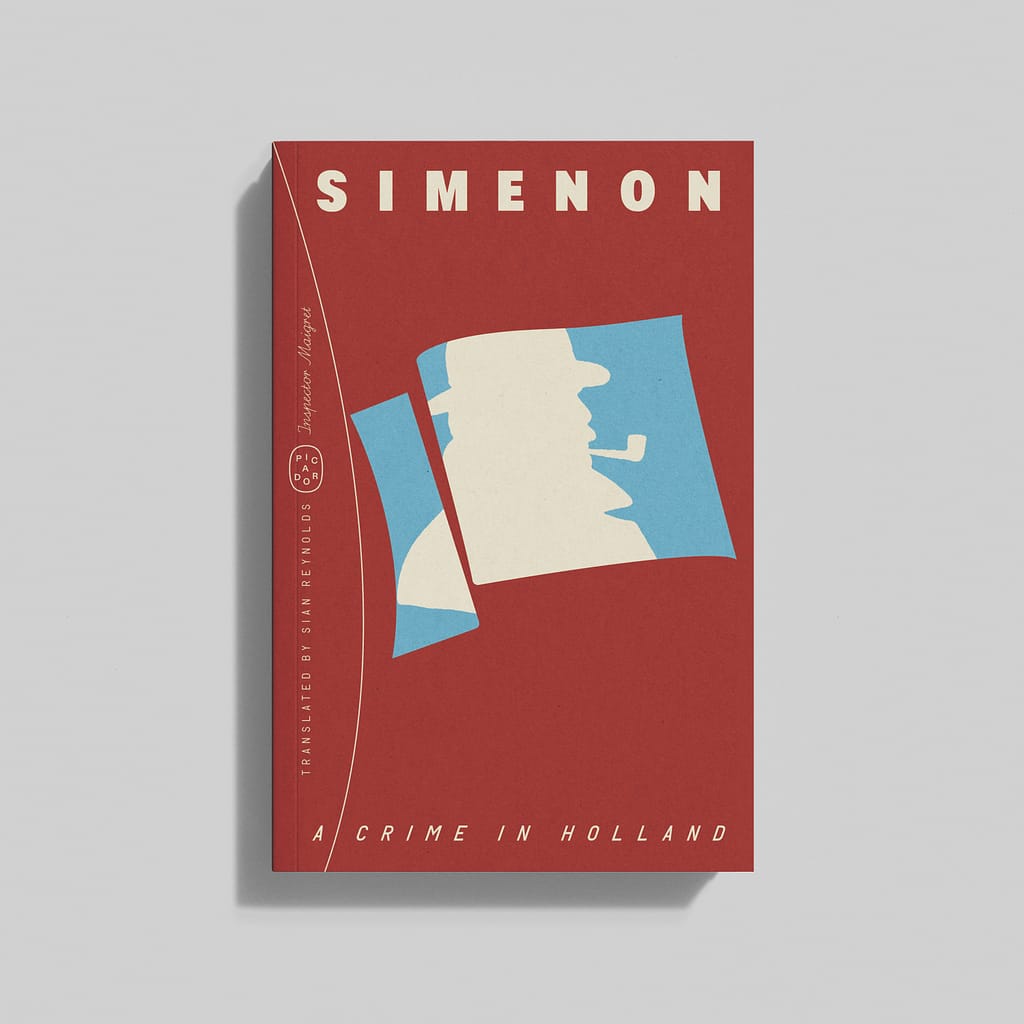
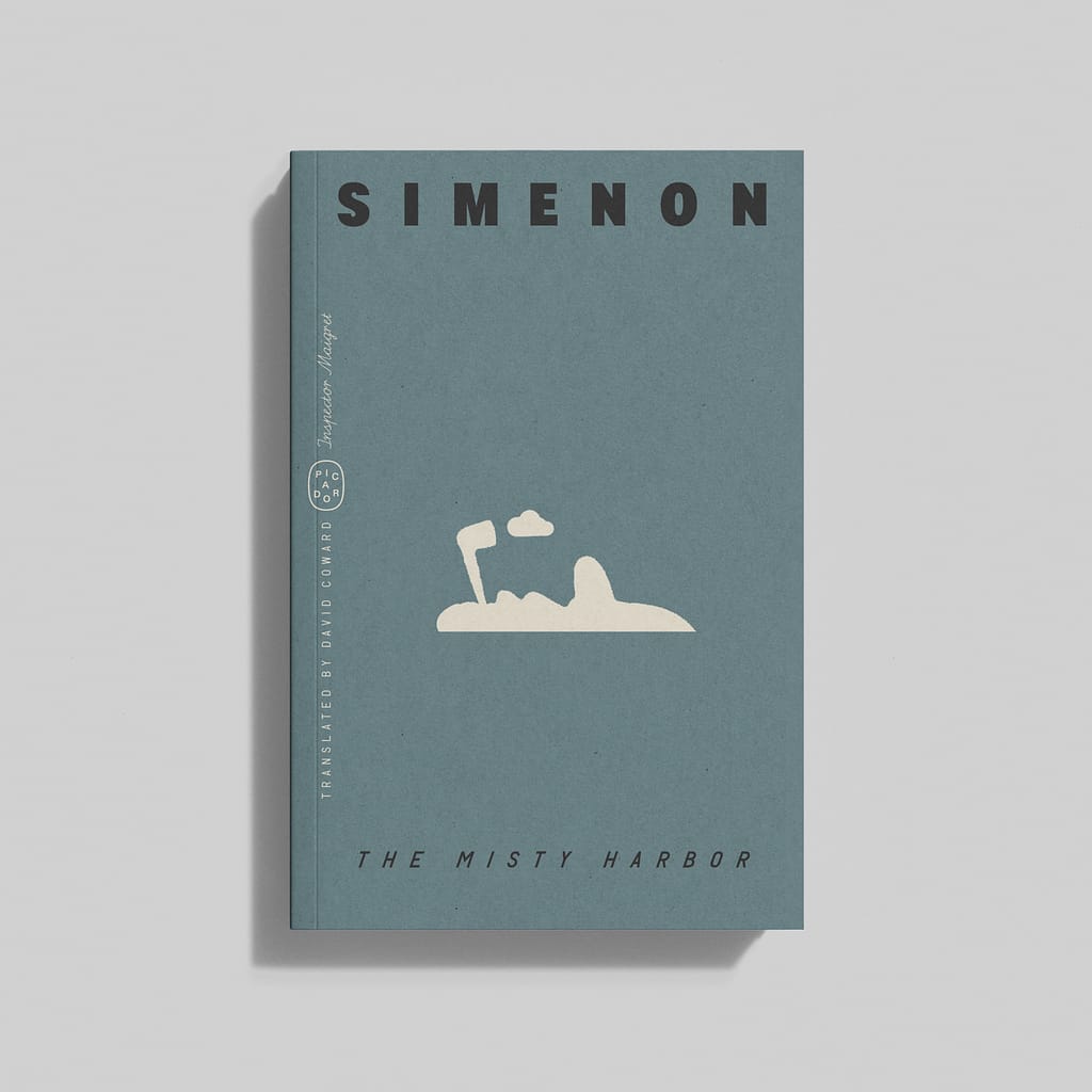
Whether those books still line the shelves, I have no idea. But if they do, it may be time for an update. Picador is reissuing the Maigret series with a bold new graphic treatment, one that plays with the detective’s unmistakable silhouette—hat, pipe, and all. It’s a timely move, considering PBS has announced a new Maigret adaptation that strips the character of both his hat and his pipe, while also transplanting him into the present day. A wretched idea, obviously. No one needs Maigret with a vape pen.
At Picador, no such liberties have been taken. For art director Alex Merto, the hat and pipe are essential, not just stylistic choices but identity markers. Inspired by Dutch designer Dick Bruna’s minimalist Maigret covers from the 1950s and ’60s—where the pipe itself became a design motif—Merto has distilled the visual essence of Maigret into a modernist language. “The trick is not to see it as 400 books but as a system, a language that needs to be built,” he says. So far, he’s completed about 20 covers. Just 380 to go.
By restricting himself to variations of Maigret’s silhouette, Merto has created a visual identity that is both distinctive and disciplined. “You’re changing the author a little bit into a brand,” he says. It’s a philosophy that extends to Merto’s recent overhaul of Tom Wolfe’s back catalog, illustrated by 93-year-old Seymour Chwast, co-founder with Milton Glasser of the legendary Push Pin Studios. The covers, all kinetic energy and retro wit, call to mind a mix of Playboy circa 1965 and Yellow Submarine. They’re also, unusually for today’s publishing climate and tendency towards print-on-demand (Penguin: we’re talking about you), brilliantly printed. “Somehow they’re bright and poppy,” says Merto. “Like, magic is happening on those covers, there’s no special inks.”
If the visuals do the heavy lifting, the typography works in tandem, rather than in opposition. “There’s nothing worse than a title just sitting on top of an image,” Merto says. “The best typography doesn’t decorate. It just has to feel embedded in the design.”
Merto himself came to design sideways. Growing up in Orange County, he spent his youth surfing, skating, and playing music. “I was aimless,” he admits. His first foray into design came through album covers and posters for local bands, created with little formal knowledge but a strong instinct for visual storytelling. When his girlfriend moved to New York to study fashion, he tagged along, scraping together a portfolio and landing a spot at the School of Visual Arts. “I had no idea what a portfolio was supposed to look like,” he says. “I was gluing leaves on paper and drawing on top of it. It was a trainwreck.”
But something about the trainwreck worked. At SVA, he found himself in the orbit of Paul Sahre, the graphic designer behind iconic book covers for Chuck Klosterman, Clarice Lispector, and Rick Moody—and something of a mentor for the young apprentice. Through Sahre, Merto crystallized a philosophy that still guides his work today: “The best covers don’t just sit on a book; they change how you enter it.”
In a world where books increasingly compete with the ephemeral, a cover has to function at every scale—on a shelf, in someone’s hands, as a thumbnail online. But more than that, it has to last. “Trends pass, but a good design stays relevant because it’s built on something deeper than aesthetics,” Merto says. You could say the same for good writing, too. Simenon, one suspects, would approve.