E.McKnight Kauffer, a modernist who wanted to liberate art from the galleries, left an enduring legacy in his designs for book jackets, London transport, and advertising.
Britain has a celebrated position in graphic design, but some of the most enduring images of the first half of the 20th century are the work of an American, E. McKnight Kauffer, particularly in the arena of posters and book jackets. In the introduction to a new compendium of his work (E. McKnight Kauffer: The Artist in Advertising, Rizzoli), curators Caitlin Condell and Emily M. Orr point out that by the early 1920s he was already so popular that a waiting billboard would trail his imminent arrival like a movie star: “A New McKnight Kauffer Poster Will Appear Here Shortly.”
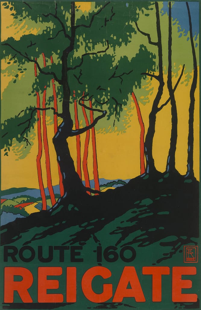
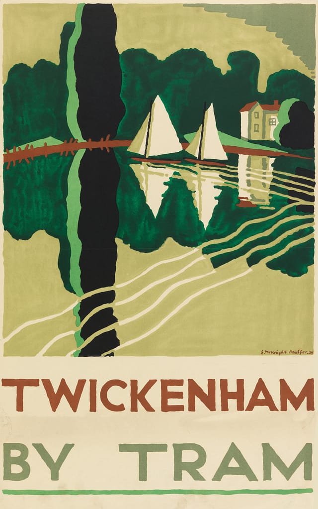
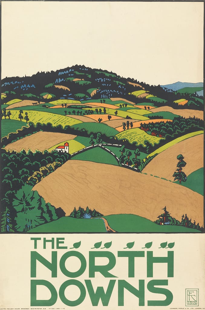
A modernist who wanted to liberate art from the confines of galleries, Condell and Orr present Kauffer as a restless populist who instinctively understood how to “synthesize [the] conventions of the avant-garde” without alienating his clients and the wider public. Quite the opposite: they were enamored. His posters for the London Underground and regional railways, in particular, struck a chord with their evocative color palate and art deco flourishes. His design for Route 160 Reigate avoids the obvious by conjuring a tableaux of trees that might glimpsed, fleetingly, from the carriage of a train rather than a chocolate box depiction of the medieval market town at which the line terminates. Shorn of type, it could be a Fauvist painting, which was likely the intention.
Kauffer described his posters as “not unlike a terse telegram that gets to the point quickly.” The same could be said for his book jackets. T.S. Eliot claimed that Kauffer’s illustrations were the “only ones he could endure,” and his jacket for the 1949 edition of Ulysses (published after the Supreme Court lifted the long-standing obscenity ban) still stands out today as the definitive cover, elevated by its elongated and dissolving U and long skinny L.
He wasn’t always on point. Designs for a book by British fascist Oswald Mosely suggest a curious lapse in judgement for a man who would become actively engaged in peace movements such as the Cambridge Anti-War Council and the Peace Pledge Union. Langston Hughes resented Alfred Knopf for foisting Kauffer on him to illustrate his poetry collection, Shakespeare in Harlem. Although Hughes’s opinion softened after publication, it rankled that he wasn’t given the choice of working with a Black artist.
By that stage, Kauffer was already celebrated enough to have been the subject of a retrospective at New York’s Museum of Modern Art (in 1937). But although Kauffer returned to the U.S. in 1940, and continued to create memorable covers and posters, his work never quite reached the zenith of his British years, perhaps because the American ad market was more straitlaced in the ’40s and ’50s. In one of this monograph’s many excellent essays, the art director and critic, Steven Heller, writes of Kauffer’s struggles to “re-create the level of fulfillment he had won in London.” A mental breakdown in 1941, was followed by a long slide into alcoholism and cirrhosis. Kauffer died in 1954 after falling into a coma. Frank Zachary, the editor of the short-lived design magazine Portfolio, would later recall that “Ted was a lost soul. Here was the most civilized, urbane man I ever met, and the top designer in England, unable to acclimatize himself to New York and American advertising.”


